The Importance of Color Contrast in Web Development
When it comes to web development, there are many crucial factors that contribute to the overall user experience. One of the most vital but often overlooked elements is color contrast. The combination of colors used in a website plays a significant role in enhancing accessibility, readability, and overall visual appeal. In this article, we'll explore why color contrast matters and how it impacts website usability.
Accessibility for All Users
Web accessibility is a fundamental principle that ensures all users, including those with disabilities, can access and interact with websites effectively. People with visual impairments, such as color blindness or low vision, heavily rely on color contrast to distinguish between different elements on a webpage.
By providing sufficient contrast between text and background colors, developers can make the content more legible for these users. Using colors with low contrast can result in the content being difficult to read and might even exclude certain individuals from accessing the information altogether.
Web developers should always strive to meet the accessibility standards and guidelines, such as Web Content Accessibility Guidelines (WCAG), to create an inclusive online environment that caters to all users.
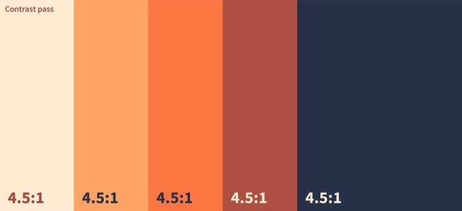
You can use online tools for check color contrast online. For example set background and text colors for get contrast report:
Enhanced Readability
When choosing colors for text and background, it's essential to consider their contrast ratio. A high contrast ratio between text and background improves readability and prevents eye strain, making it easier for users to consume the content.
Black text on a white background has long been considered a standard for optimal readability. However, this doesn't mean all websites should stick to this combination. Different design aesthetics and brand guidelines might call for other color schemes, but maintaining adequate contrast should always be a priority.
When introducing new color schemes, it's crucial to test them with real users and gather feedback to ensure that readability is not compromised.
Visual Hierarchy and Call-to-Action
Color contrast also plays a pivotal role in establishing visual hierarchy on a website. By using contrasting colors for headings, subheadings, and body text, developers can guide users' attention and make the content more scannable.
Additionally, call-to-action (CTA) buttons benefit significantly from well-considered color contrast. A high-contrast CTA button stands out from the rest of the content, making it more enticing for users to click and take the desired action, whether it's making a purchase, signing up for a newsletter, or any other conversion goal.
Branding and Aesthetics
Color contrast isn't just about accessibility and usability; it also plays a crucial role in branding and aesthetics. Consistent use of color contrast in line with a brand's identity helps create a memorable and visually appealing experience for users.
When users associate certain colors with a brand, they are more likely to remember and recognize it in the future. Carefully chosen color palettes and well-implemented contrast contribute to the overall aesthetics and user perception of a website or brand.
Responsive Design Considerations
In today's world, where mobile devices are widely used for browsing the internet, responsive web design has become a necessity. Color contrast becomes even more critical in responsive design, as the same website needs to adapt to various screen sizes and resolutions.
Ensuring that the color contrast remains adequate across different devices and screen orientations is essential for maintaining a positive user experience. It prevents readability issues and ensures that the website's content is easily accessible, regardless of the device being used.
Conclusion
Color contrast is a fundamental aspect of web development that significantly impacts accessibility, readability, visual hierarchy, branding, and overall user experience. As web developers, it is our responsibility to create websites that are inclusive and accessible to all users, irrespective of their abilities.
By understanding the importance of color contrast and following accessibility guidelines, we can build websites that not only look great but also offer an excellent user experience to every visitor. Investing time and effort into optimizing color contrast is a small but powerful step towards creating a more inclusive and user-friendly web.